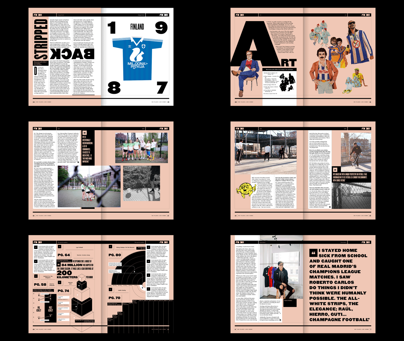
atomic-age associates is the studio of information designer Adam Sharratt.

01


2024

Digital

Financial Times
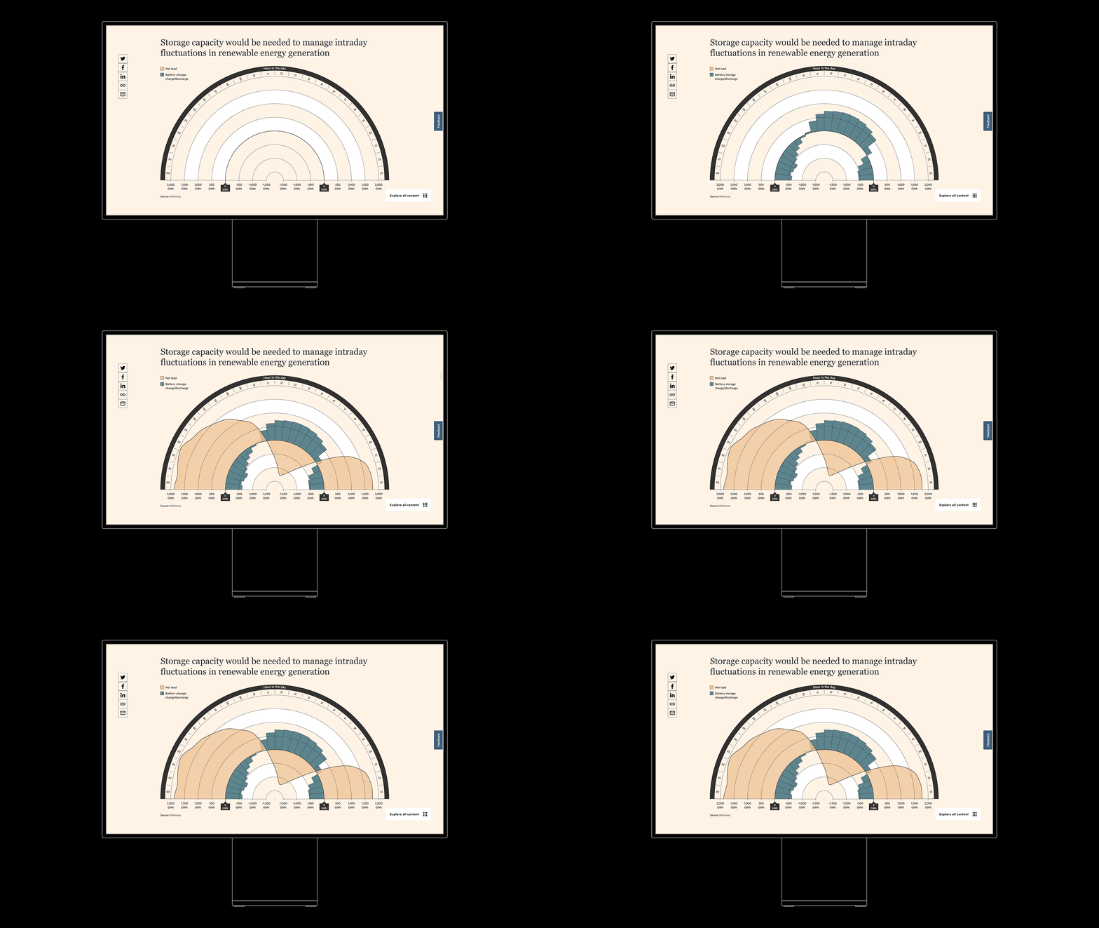

A digital chart illustrating storage capacity needed for managing intraday fluctuations in renewable energy, featuring a semi-circular gauge with hours in the day, net load, and battery storage charge/discharge, sourced from McKinsey.

I was commissioned by The Financial Times to produce a series of bespoke data visualisations as part of their FT Energy Source channel. Partnering with the Spanish energy giant Iberdrola, the project consisted of three animated data visualisations for both desktop and mobile applications.

You can read the full article here.

Two smartphones displaying financial data charts and infographics, with a black background.
Digital infographic titled 'In numbers: Iberdrola's electrification drive' with five 3D blocks in a diagonal line, the first four in blue and the fifth in red, on a beige background. A source note reads 'Iberdrola Capital Markets Day 2024'.
Two smartphones display bar charts from the Financial Times about the lithium-ion battery market, showing price trends from 2010 to 2020 and projected demand up to 2030.
Bar chart showing projected cost reductions for lithium-ion and sodium-ion batteries by 2030 compared to global market demand, with social media sharing options on the left and source credit at the bottom.

Print

02


2021-24


These Football Times

Color-coded infographic showing football teams, players, and match outcomes across different nations and years.

These Football Times is a bi-monthly print magazine that works alongside some of the world’s finest clubs and brands.

We collaborated on infographic spreads for 12 issues over 3+ years, which included collaborations with such esteemed teams and brands as Nike, FC Bayern Munich, Adidas and Juventus FC.

A detailed infographic illustrating the history, achievements, and match statistics of the Italian football club AC Fiorentina, with team crest and key milestones.
A detailed infographic illustrating the history of Bayern Munich football team in Bundesliga, featuring a circular chart with red and blue bubbles indicating game wins, draws, and losses over the decades, along with sections highlighting longest serving managers, managers with the most honors, all-time most appearances, and top goalscorers.
A detailed infographic about Italy's national football team, including player stats, club transfers, and Italy's World Cup history, with a map highlighting Italian football clubs.
An infographic chart displaying the history of Juventus football club wins, including various cups and tournaments, with black background and white lines and text, arranged in a circular timeline.
A detailed infographic depicting the history and evolution of Nike football boots, highlighting key launches from 1971 to 2024, FIFA World Cup representations, and winners. The infographic includes text, diagrams, and a timeline with notable milestones and models.
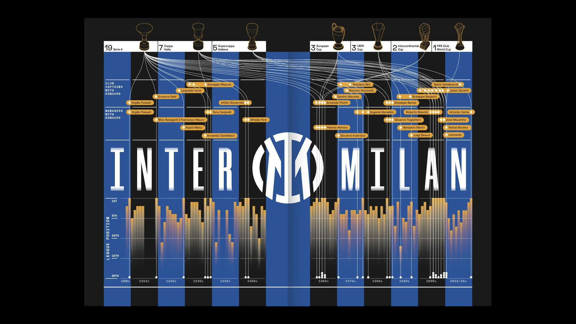
Infographic displaying Inter Milan's history and achievements, with connections to players, managers, and trophies won from the early 1900s to 2020s.
Infographic about Valencia CF including top managers by matches managed, top all-time appearances and top goalscorers, with charts, trophies, and team logos.
Infographic featuring Napoli football club's 2022/23 season statistics including a circular diagram with match results, top scorer list, top assister list, league performance, and attendance figures, with various charts and maps.
Infographic showing the history of Japanese J-League football clubs, including founding years, stadium capacities, honors, and performance data from 1983 to 2022.

Print & Digital

03


2018

Sonos


A two-page infographic featuring a black background with white geometric line art. The left page shows a rising wave-like pattern representing data from 2015 to 2020, with text indicating 'SONOS' and 'Global smart speaker sales.' The right page displays a sharp, peaked line graph illustrating Spotify premium subscriptions by country, including Denmark, Sweden, the U.S., the U.K., Norway, Canada, and Haiti.

While at the design studio S/R, I led the design of Sonos’ first ever guidelines on data visualisation.

Both setting a creative direction for their data style, as well as a practical guide on how to maximise it, the final result was a 200+ page tome covering all aspects of the process in creating great visualisations.

Cover page of a document titled 'Data Visualization Guidelines' with 'SONOS' and 'Tier 02' written on it, on a black background.
A digital tablet displaying a data analysis guide from SONOS, with numbered steps on evaluating data sets, analyzing pages, and choosing graphic solutions, against a black background.
White icon graphics of various data visualization and marketing concepts on a black tablet screen, including graphs, charts, and symbols for audience, data, decrease, growth, insights, partnerships, sales, Wi-Fi, and more.
infographic showing market share percentages of different countries, with Denmark, US, UK, Sweden, and Netherlands represented in a descending bar chart, alongside large text highlighting 'forty-four million'.
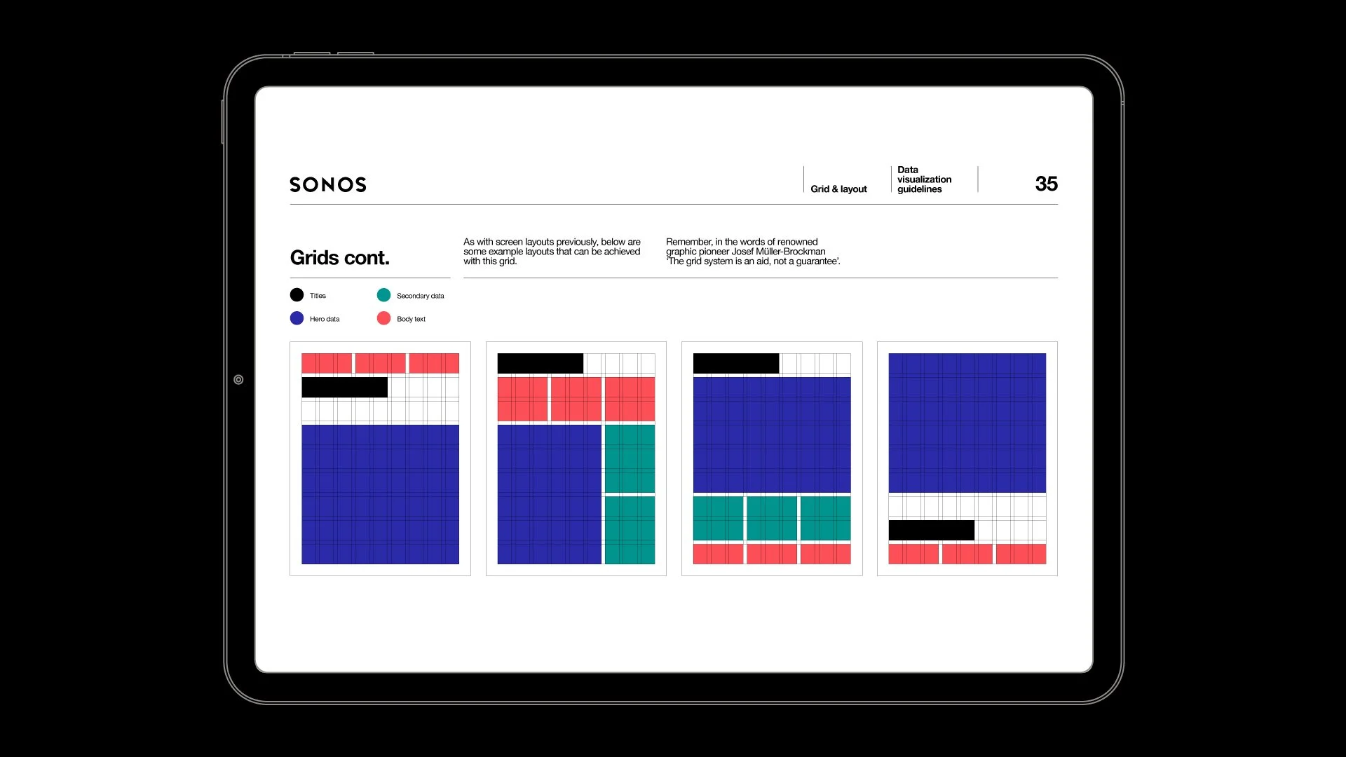
A tablet displaying a page with charts and text related to data visualization guidelines and grid layouts.
A tablet displaying a stacked area graph titled Streamed area graph hero data, with three groups in different colors—red, teal, and blue—showing data over six time points, against a black background.
Close-up of a digital tablet displaying a large stacked bar chart with three colorful sections labeled with 'XX' and small text indicating labels and hero data.
Comparison of Sonos market share in the U.S. and global. Left side shows a bubble chart with market share percentages for Denmark, UK, US, and other countries. Right side displays bar graphs indicating Sonos ownership base at 42%, MML's 75%, and other statistics related to Sonos.

04


2022


Print

Courier


A two-page infographic about inflation's impact, featuring circular and line charts showing data and trends on consumer spending and household expectations in the United States from 2020 to 2022.

Courier is an independent magazine with correspondents around the world searching for new stories of people making a go of what they call ‘modern business’.

We collaborated on 10 infographics over three issues that varied in size from small page inserts to double page spreads and spanned topics as varied as digital fashion and elder care.

Magazine open to a two-page spread featuring a bar graph about mobile phone sales from 2019 to 2021 on the left page, and a photo of a person repairing a smartphone on the right page. The spread includes various orange and purple highlights and text discussing technology and repair challenges.
Open magazine with articles on social media, aging, and healthcare technology, including charts and infographic with statistics on various topics.
A magazine spread with a red, black, and white color scheme, featuring a large white headphone image on the left and various charts, graphs, and text about music industry data on the right.
Open magazine with articles about telehealth, electric vehicle charging stations, and the proportion of electric vehicles sold worldwide in 2021. The right page has an image of an electric truck charging at a station.
An open magazine spread featuring articles on blockchain, the dating economy, and smartphone usage, with charts, graphics, and colorful sections.
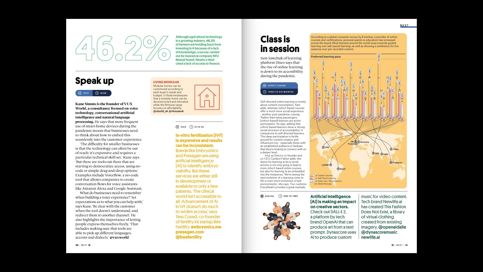
An open magazine spread featuring articles about technology, online learning, and artificial intelligence, with a world map illustrating global supply chains.
Two-page magazine spread featuring charts and infographics about supply chain delays, social media study sessions, and NFT funding, with text, percentages, and an animated character illustration.
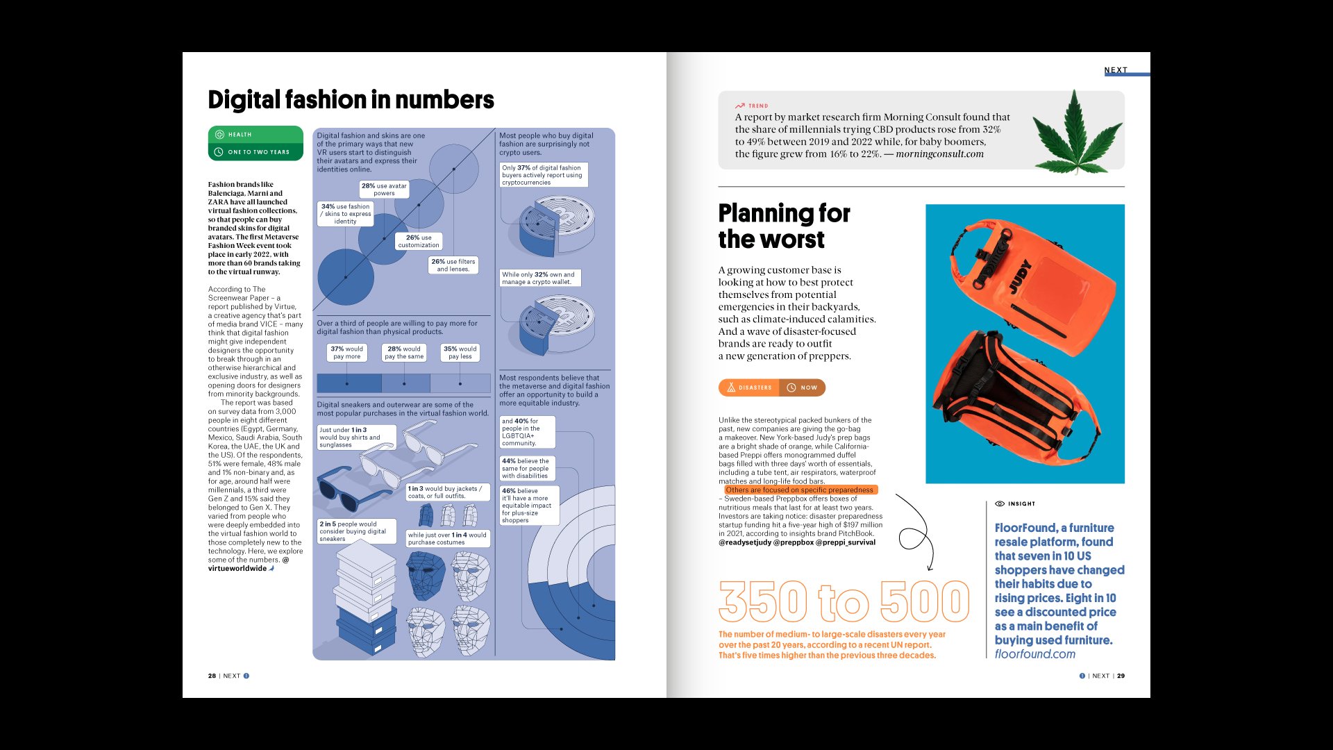
A two-page magazine spread titled 'Digital fashion in numbers.' The left page contains statistics and infographics about digital fashion, virtual avatars, and consumer behavior, with text boxes and illustrations. The right page features a report about CBD market growth, a section on disaster preparedness, and a large image of an orange waterproof bag and a smaller pouch, with an article about changes in shopping habits due to rising prices.

05


2019-23

Print


No Place
Like Home

A detailed infographic featuring maps, charts, and text about football statistics and history, with red, black, and white color scheme.

Our long-running collaboration with No Place Like Home magazine, a London-based independent football publication, started with two issues of providing supporting data pieces for leading articles in two issues.

This evolved into producing the running feature ‘The Issue by Numbers’, where six key articles from that issue were augmented with supporting data points to create a combination of preview, infographic and contents page.

This ran for six issues before we took the reigns for two issues, providing designs for all features and the info-led, introductory section – ‘Front’.

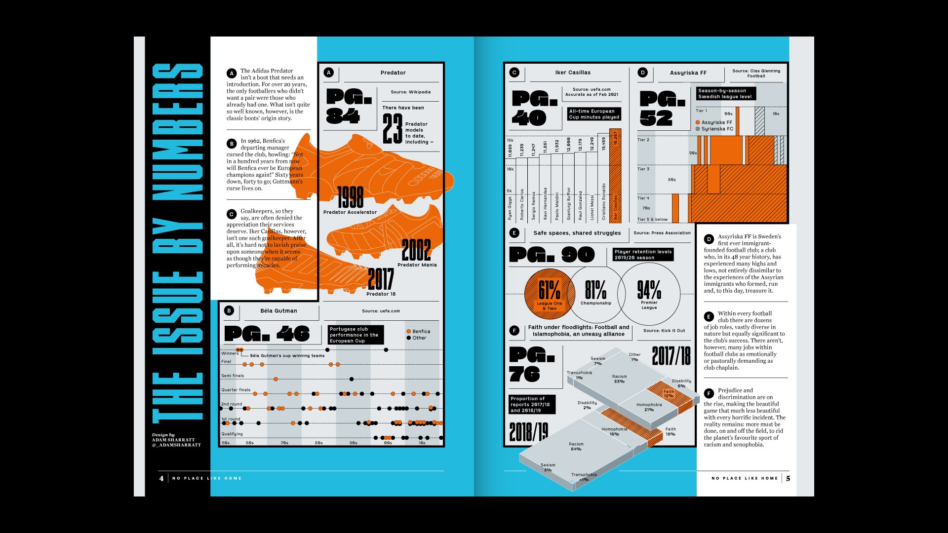
A magazine spread about the LA Galaxy soccer team featuring a black and yellow striped soccer jersey with red and blue accents and the number 10, with large bold text reading 'Striped back LA Galaxy 1996.'
A detailed two-page infographic about football, featuring sections on the history of football boots, European club performance, player statistics, and social issues like discrimination, with various charts, images, and statistics.
Magazine spread featuring an article about Finland's national football team and a blue Finnish football jersey with logos, the number 9, and text 'MILJOONATOKKUA'.
A double-page infographic featuring a world map and various graphics about football players, countries, and data highlights. The left page shows a timeline of football managers in England, with red illustrations of football boots, and country-specific facts. The right page includes data on academy prospects, football operations, and community service, with icons and statistics.
An infographic about football statistics and facts, including attendance, records, and social media engagement, with a stadium background and various labeled sections.

06


2019

Digital

Spotify


A 3D graph chart contrasting Spotify artist rankings with PPL artist rankings, displaying scores across different ranking categories on a black background.

While at the data-led design studio infogr8, I led the visual design for two projects with the global audio streaming service Spotify.

Working with their in-house data team, we were brought on board to provide fresh creative direction to the design of two internal analytics tools with the aim of helping the team uncover fresh insights into their wealth of data.

A digital music analytics dashboard displaying Spotify data, with a radar chart at the center and text sections on either side showing artist name, track name, total streams, and genre, on a dark background with green accents.
A visual music analytics dashboard with a black background. It features a radar chart showing streaming data over time with colored areas, a circular gauge indicator, and placeholders for artist name, track name, total streams, and genre.